Today, we released a few key improvements to the Linode Cloud Manager. We continuously collect feedback on how to improve customer experiences on our platform, and these updates are the result of feedback we’ve gathered over the last several months. This release focuses on:
- Updated navigation and more intuitively condensed menu items
- More detailed information on Linodes (plan type, creation date, and tags)
- Expanded network usage metrics and information for individual Linodes
- Open tickets and system status included in Notification pane
As part of this effort, we’ve also shipped a number of performance improvements to the Cloud Manager over the past several months. (You can check out our release history for more details).
While the interface remains consistent with the previous iteration, there are a couple of areas we’d like to highlight to help you navigate smoothly within Cloud Manager:
New Home Page
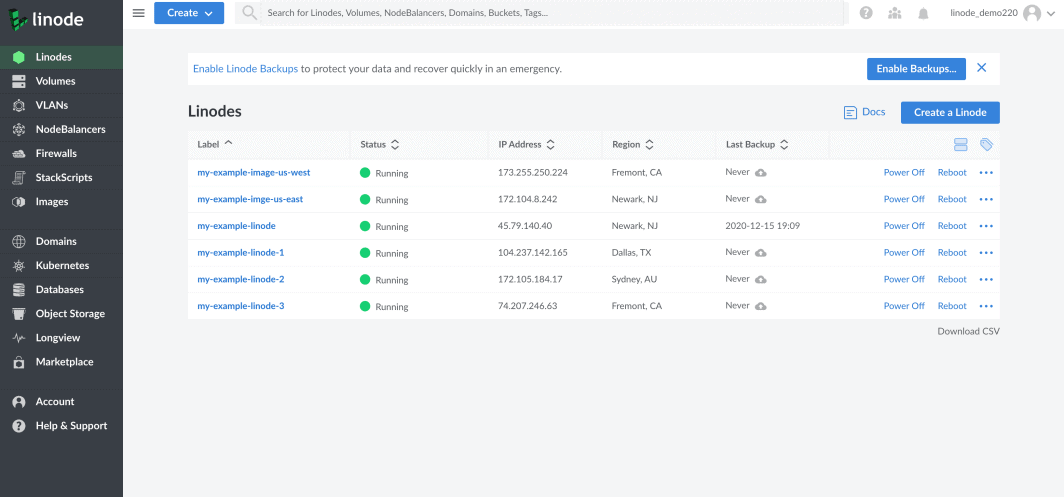
Previously, when signing in to your Linode account, you were directed to a Dashboard page. This has been combined with a summary of your Linodes, including a visual status indicator and increasing the number of visible controls on a standard desktop browser.
Experience for Existing Users

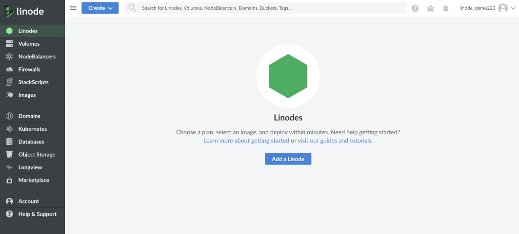
Experience for New Users

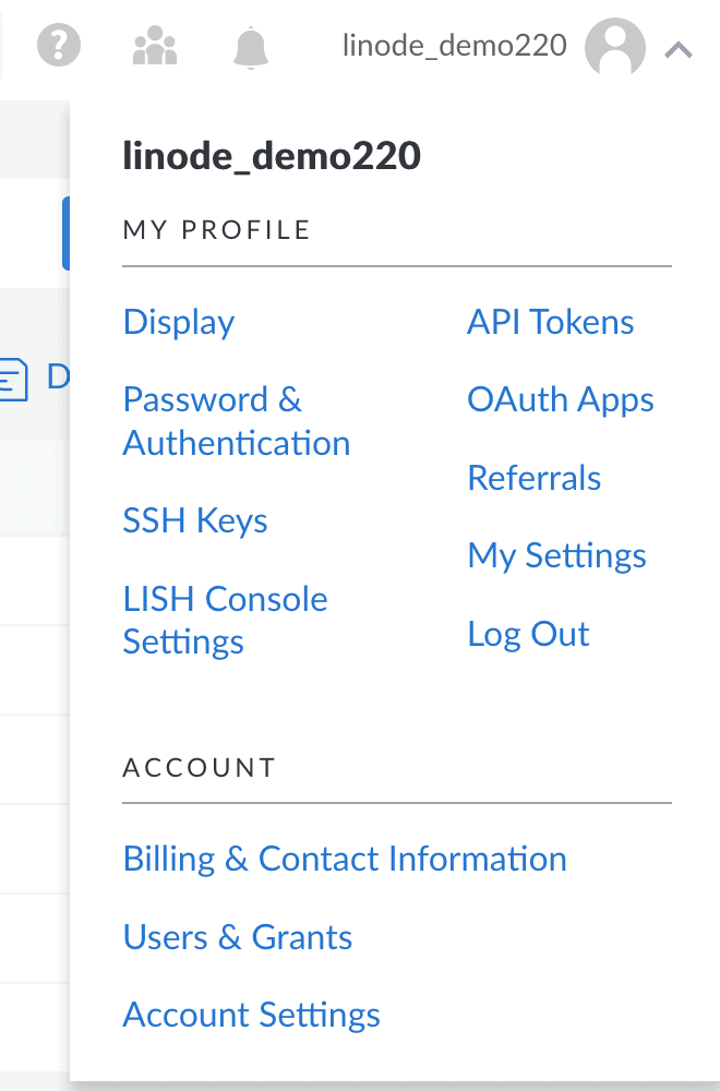
Adjusting User Settings & Accessing Billing
Settings that were separated into “Account” and “My Profile” have been consolidated under the “My Profile” icon in the top right navigation.

Where can I find:
- Light vs. Dark Mode? Under Settings in My Profile
- Compact Mode? The entire interface is more compact; this setting has been eliminated.
- Monthly Network Transfer? Click on an individual Linode and navigate to the Networking tab.
Accessing Billing
You can quickly access Billing via the Account link in the main navigation.

Updated Individual Linode View
There is now more information available about individual Linodes including what you’re running, the Linode ID number, and when that Linode was created. SSH access is now shown under the Network tab, and controls have been consolidated and organized to be more intuitive for users.

Improved Notifications Drawer
The notifications drawer includes your system status, pending actions, a list of open support tickets, and invoice information when applicable to make it easier to find critical information about your infrastructure and account.
We’re always working to improve the overall customer experience, usability and performance of our Cloud Manager. If you’d like to register feedback on these updates, visit https://www.linode.com/feedback/.


Comments (29)
very good!
You removed the information about total network transfer usage across all Linodes in the account, though. 🙁
Thanks for bringing this up. Your Network Transfer Usage can now be found under your Linode’s “Networking” tab.
I appreciate that it can be found in the “Networking” tab, with a more detailed breakdown of the usage, but having the overall listed on the front page was very helpful and it would be nice to have it back.
The status of the overall monthly traffic pool is more useful than each usage.
Individual Linode overages don’t matter
I’m in agreement with Mike.
So many times, companies change things that really don’t need to be changed, and end up making it worse in the process. Then when people complain, you get the typical “we’re listening to feedback” kind of response, which just encourages them to make more pointless changes.
And the cycle continues.
We love getting feedback, and it has a direct influence on future updates, new features, and changes. It helps us get a sense of how much interest there is in a change and how we can improve. I’ve added your request for an overall Network Transfer meter on the main Linodes page to our internal tracker for review. If you have any suggestions or ideas, or if you just want to let us know what you think, you can always email the team here directly at feedback@linode.com.
change not always good
It has the agility of the previous version… :D.
At the beginning of the year it was terrible slow, and although I improve enough with new updates I never surpass to the deprecated version… it was something that was missed a lot. Congratulations for the change!
Thanks for the kind words, David! The only thing constant is change. And we’ll continue to strive to change for the better. ?
BAD!!!
Looks great! Thank you.
Can the homepage be set to display total traffic?
I agree with the other comments regarding total network transfer. It’s the actual statistic most of us care about, rather than individual nodes. I can’t imagine why someone actually thought it was a good idea to remove it, but it’d be nice to get it back!
We appreciate all of the feedback regarding visibility of total network transfer usage on the front page of the Cloud Manager. We hear where you’re coming from, and we’ve passed this feedback along internally so that we can look at moving the location of this information from individual Linode Network tabs to the front page.
Thats great. Last time I had sent some suggestions too to the creative team. I wish the fonts could change to roboto or Gotham.
Very negatively impressed. IMHO, this is change for change’s sake and offers no advantages for me and several disadvantages. Please stop “fixing” things that aren’t broken and making things worse (the Cloud Manager change several years back was also worse than the earlier version).
I’m sorry to hear how these changes have negatively affected your experience using our platform, though we certainly appreciate you taking the time to let us know. If you have any specifics that you can share regarding the changes, we’d love to hear them. Much of the changes came directly from customer feedback. Should you want to provide more details than a blog comment would allow, you can send us an email at feedback@linode.com.
Looks great! I love this style.
Well, i would still like to see some info about the size of the linodes in list view, it is very useful a lot of time. Especially since list view contains columns that i don’t really care about ( last backup, or even the running text in status column ).
Summary view has it, but that contains to many info ( ex. i access LISH console like once per year – with close to 100 linodes – i don’t really need that info on list/summary view. Same with SSH access, why would I copy/paste that from the view ?
Hey Sandor – having the Linode size listed is a great call out. While I can’t make any promises, I’ve passed along the suggestion internally for consideration.
Update: Looks like we’ll be bringing this feature back! I don’t have a specific date to give you, but the functionality will return soon.
Looks good in coming year!
Loving Linode
These changes may be good visually but certainly not functionally. I agree with Jonathan’s comments above, though I used a different “f” word in a support case I raised on first encountering the changes! I was pointed here, so I’ll raise my gripes publicly:
1) Ostensibly the ability to sort the disks on the Storage screen is good. EXCEPT that the old sort order (which was by disk creation time / order) is no longer possible. So you’ve gone from it being the only sort order available (iirc) to not being available at all!
So, for example, if you locally clone a disk called DISK it will create a new disk called “Copy of DISK”. Doing the same thing again will create another disk also called “Copy of DISK”. So it’s now impossible to tell which one is which because you no longer sort on creation order.
The solution to this is to include a sortable date-created or creation-index column
2) You no longer indicate on the Storage page how much storage is used / available. So are we supposed to add the column up for ourselves now and do mental arithmetic?!
3) After initiating a Disk clone from the Disk screen, the user is deposited back on a different screen – the Configuration screen. That’s not helpful.
4) You’ve moved the Configuration screen to a new page. There’s a tight coupling between Disks and Configurations, though, requiring constant reference between them which this makes harder. Eg before doing a Disk Deletion, it’s often desirable to verify the current primary disk before doing a disk deletion! This now requires the user to change screen, review the config, return to the previous screen.
If you want to have the Configuration as a separate screen, put a status marker against listed Disks to indicate whether the disk is referenced from a Configuration profile, and if so whether the profile is active (running) or not. Even better, make this marker a sortable column
5) When doing a Disk clone the sort order of the Linodes displayed is seemingly random within the datacenter, making it hard to find targets.
A very common target will be to clone the disk to its own machine, requiring unnecessary (and possible error-prone) searching for what in a previous UI iteration used to be a simple checkbox selection (iirc). There should be an easy way to just say “Clone to myself” – for example just display the current machine as the first entry in the dropdown list; that should be trivially easy and obvious for anyone who puts actual thought into how the UI is used.
AndrewM – you make some really good points. Without getting into things one-by-one, I can tell you that I’ve brought up several items here for internal review.
In the meantime, we’ve heard feedback about the ability to sort disks by creation date from other customers, and we’re aiming to release that feature this week. We’ll follow-up with you when it’s released.
Hi AndrewM. Wanted to follow up on this to let you know that sorting by disk creation date is once again available via a Linode’s Storage tab. Thanks for mentioning it along with your other feedback!
It’s going to take a lot of fixing to get it anywhere as good and convenient and clear as the old one. Just call it a failed experiment and bring the old one back, please.
We heard you! We’ve moved the transfer pool information back to the Cloud Manager’s front page. You can now see this information as soon as you log in, as well as under each Linode’s Network tab.
The account events page is still accessible at the same URL, but because the “View All Events” link that used to be available when clicking the bell icon, it is no longer possible to navigate to it as described @ https://www.linode.com/docs/guides/what-are-the-cloud-manager-events-and-activity-feeds/
This change makes it necessary to either bookmark the events page or remember the url and enter it by hand every time I want to visit it.
The changes are quite impressive and make us easy and confortable across linode enviroment..